Spammers and Their Favourite Tweets
I’ve recently seen this blog, and thought that was really nice. It was saying that some people buy applications which favourite random tweets on behalf on themselves, leading to an increase in the number of followers. Then I thought, well, this could mean that people who favourites violently could be the spammers we’re looking for! I had to see it for myself, so I did.
I worked on the set we collected during 36th Istanbul Marathon. I extracted user ids with number of tweets they favourited. Then I extracted first mentions in tweets. A first mention is not necessarily a retweet, although quite likely it is. It’s just the first mention in a tweet. Say Cartman tweets “Hey @Kyle, how are you? We’re having fun with @Kenny!”, then we would have an edge from Cartman to Kyle only.
We had 23499 users and 24401 mentions. No calculations were done, but see graphs for yourselves. Nodes are Twitter users, edges are mentions. From the last example, Cartman and Kyle would be nodes, and there will be an edge from Cartman to Kyle. Kenny does not necessarily exist, not to mean we killed him off.
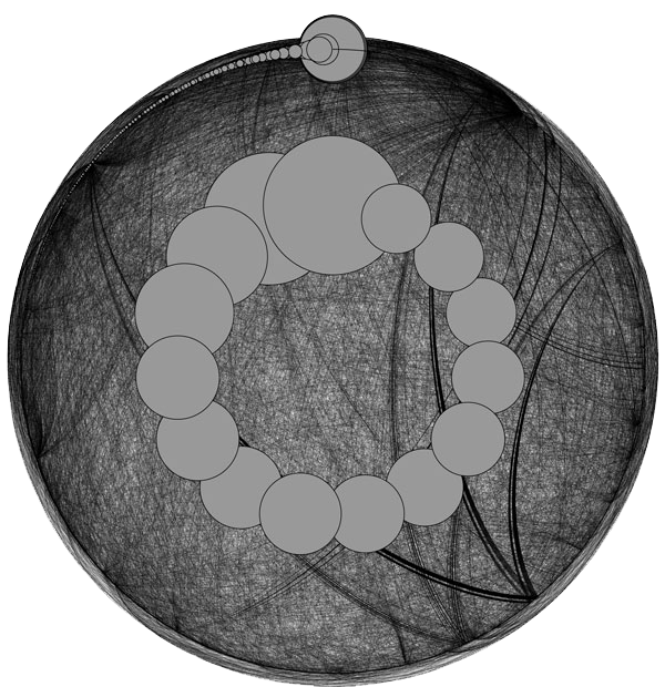
First graph is here to show an example of dual circular graph. There are two circles, as the name suggests. You’ll see very few nodes in the inner circle, and more on outer. Circles are ordered by in-degree. This means, nodes of inner circle are the top mentioned users and outer circle is sorted as well. Node sizes also represent in-degree, so that the graph is easier to understand. Sorry for the weird shape, I couldn’t make it into a real circle.
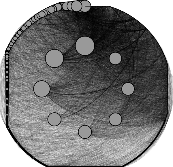
This is very similar to the previous one, except the parameter we use is different. Size means favourite count: The more tweets a user favourited, the bigger its node. The circles are ordered according to the same parameter, favourite count. Circle ordering, hence places of nodes will stay the same in the following graph.
Can you see what we did here? The only change is the sizes of nodes, no change whatsoever is made to the places of nodes. Size here implies out-degree, i.e. the more mentions a user makes in the tweet set, the bigger its node. “But wait, you implied out-degree was going to be correlated with fav-count? I can barely see the inner circle!” Exactly. I’m surprised as well. What exactly happened there? I have four different answers.
There is actually no correlation at all
Well, at least we tried. We thought that someone with aggressive favourite behaviour would write more mentions in a given set, but it doesn’t look like it. We can try with more parameters in future, and see what is going on.
Or, there is some correlation
It is also possible that there is an actual correlation, but we can’t infer to it by just looking at the graph. We might need to get our hands dirty, and do some calculation to see it for real.
Marathons are no cool
Maybe we have some spammers in our list, but they didn’t reveal themselves because running is new in Turkey. We should do the very same experiment with another topic. If we want to stick to sports theme, we may check a soccer game.
We failed for constraints
We had the data, but we did not actually work on it in detail. We might have been more picky in selecting what to graph. These graphs includes every single user! We might have applied some enforcements. “Don’t include anyone with more than x and less than y number of followers” or “don’t include accounts that were created in a week before the race” are just two examples. We need to think carefully.
I have learned my lesson, and I’ll not stop here. I’ll continue to try, and will update the blog. What do you think? Make sure to comment below, it’s a brand new feature!