Social Network on Marathon Retweets
This week, we were to prepare a social network visualization, and I enjoyed it more than I imagined. I got to learn Gephi, which is a fantastic tool. Even simply watching ForceAtlas plugin (that seperates nodes by a certain algorithm) work is entartaining enough.
What I did was to use the data I already had, although it might have been some kind of cheating. We had over 18k retweets, but I used first 5000. Most (almost all) of these tweets were posted before the race, so you can imagine it being mostly related to the expo. Here are the results:
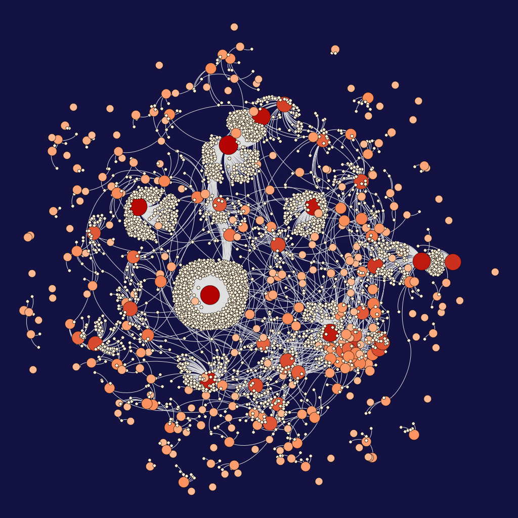
All nodes are people, and directed edges represent retweets. An edge from node A to B means person A retweeted what person B wrote. Red and big nodes are influencers, posters whose tweets were forwarded most. You’ll see shades of oranges, people who also got retweeted, but not as many as red ones. Then the yellow, the forwarders, if we were to call.
Outside the circle, you can see seperated groups. One example might be a tweet being retweeted by three people and that’s all. That is, people who retweet that certain tweet did not retweet anything else, or anything they wrote about the topic had no retweets. And the same for the original poster, too. It’s even hard to imagine that, but here they are, all around the place! I found it quite funny that one of these cliques looks really like a water molecule on the very left.
You might ask, who are those red people? Well, due to terms and conditions, I cannot reveal that information. But I believe you can imagine, or at least have an idea about that information. It’s actually some kind of dilemma about Twitter: Brilliant information posted by people with less number of followers gets forwarded much less than useless information posted by people with huge number of followers, but that’s for another blog post.